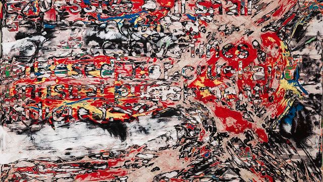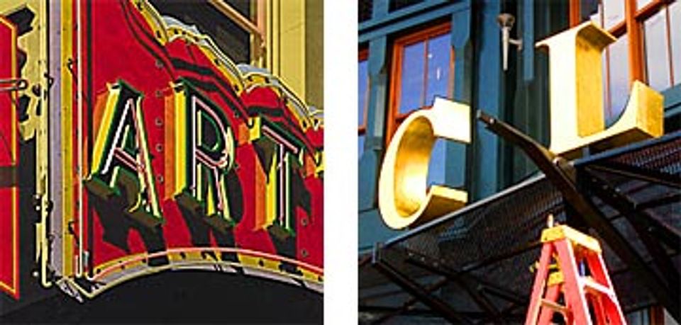
Robert Cottingham's Art, 1992, juxtaposed with a photograph of the Clydes Restaurant sign installation (Photo by Jeff Gates).
When you work in an office building, especially if you sit at a computer all day, you need to force yourself to get outside every once and a while. Fortunately a stroll around here often rewards one with something interesting to see. The museum is in a neighborhood full of change: new stores, restaurants, clubs, and dwellings open every day, not to mention the hubbub of the renovation of our building.
Thus I found myself standing at 7th and G streets NW last week, right across from the museum, gawking at a gigantic golden “L” hanging from a crane. Workers were herding the letter over to join a “C” which was already bolted to the front of a building. Behind, its’ kinfolk, the letters Y, D, E, and S were waiting patiently on a truck. By the end of the day the workers would be gone and a brace of spiffy gold letters would remain behind spelling CLYDE'S, the name of a regional restaurant chain.
I probably wouldn’t have noticed the new sign if I hadn’t witnessed it being built, and I certainly wouldn’t have noticed how remarkable the big gold letters are, or what a cool composition they make against the curving green facade and the patterned brick in the background, but I got excited when I thought of someone who would.
Robert Cottingham would have noticed. Cottingham is an artist in SAAM’s collection who has been noticing the amazing graphic compositions in commercial signs and turning them into fine art for over thirty years. He’s one of those people —maybe all artists are like this— whose eyes see the same stuff as the rest of us but whose vision allows them to turn what they see into something special.
So I had a little “ah-ha” moment there on my walk. It’s a thrill to see or hear something that reminds you of great art, even more so when it’s unexpected.

