


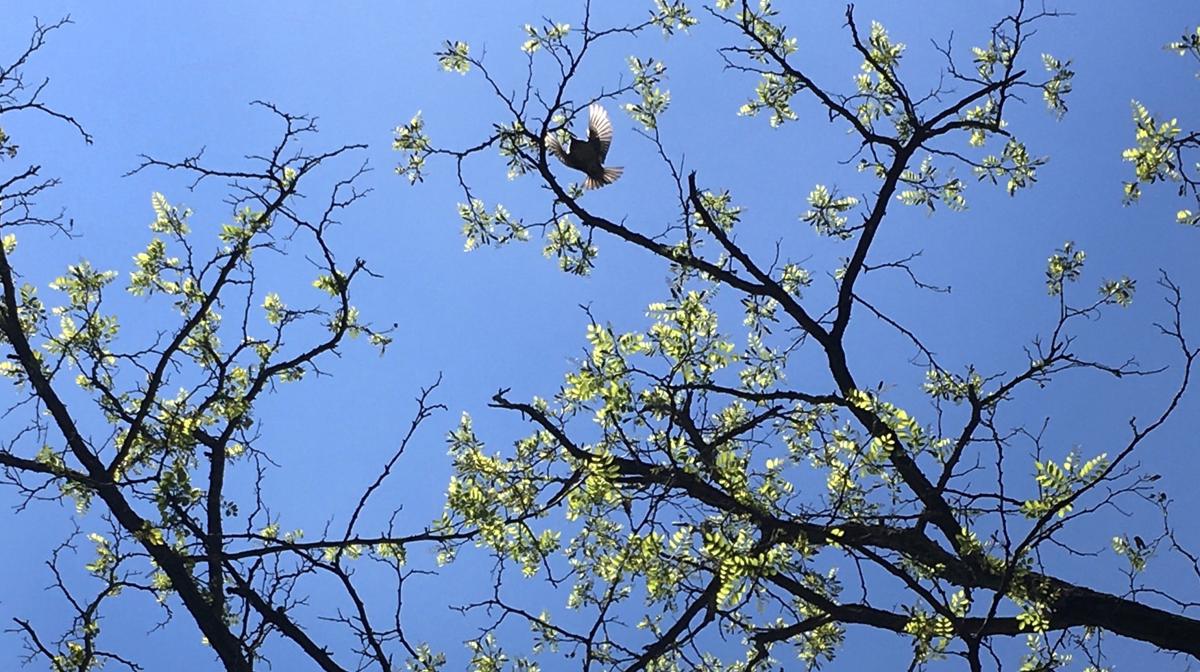
A black locust tree near Karen's house provided inspiration for her design work. All photos by Karen Siatras.
Karen Siatras is a graphic designer in SAAM's Publications office. For her most recent project, the massive exhibition catalogue that accompanies Alexander von Humboldt and the United States: Art, Nature, and Culture, she created special decorative letters at the start of each chapter in the book. They represent eleven trees and one shrub—American beech, balsam poplar, sugar maple, American elm, black locust, black walnut, American linden, sweetgum, willow oak, mountain laurel, scarlet oak, and magnolia—native to the eastern United States and present when Alexander von Humboldt visited in 1804. In honor of Arbor Day, Karen talked with Eye Level about her design process, proving that no detail is too small.
From the time he was a child, Alexander von Humboldt was obsessed with nature and all types of creatures. Do you have an affinity for the outdoors as well?
I grew up in Maine and spent a lot of time exploring in the woods and along the coast from an early age. Being outdoors is a big part of life there; most Mainers feel very connected to the natural environment and treasure the landscape in all its variety.
What was your initial thought process for bringing Humboldt’s dedication to botany to the catalogue design?
It occurred to me that Humboldt’s careful study of plant forms was similar to the process of searching for themes and relationships that I do when approaching a new design project. Humboldt traveled with a multitude of scientific instruments and collected specimens from all over to support his theory that all of nature was interconnected, a radical idea at the time. In the book, Eleanor Jones Harvey notes that Humboldt’s writings inspired a deep dedication to scientific observation and accuracy among the Hudson River School landscape painters–particularly Frederic Edwin Church, who went so far as to retrace Humboldt’s journey through South America. In Church’s sketches you can clearly see where he’s made notes about the location and colors of specific trees and plants, and then in his monumental paintings, you can see that he’s rendered every leaf on every tree in exacting detail. So it seemed only natural to honor that dedication to botany in the design of the book.
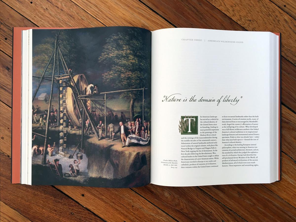
Chapter three begins with an image of a black walnut branch and its hanging flowers.
Once you decided on this design element, what research did you conduct to bring that same level of accuracy Humboldt was renowned for to the book?
I read Andrea Wulf’s fascinating book Founding Gardeners and learned that the revolutionary generation–Washington, Adams, Madison, and especially Thomas Jefferson, whom Humboldt came to the U.S. specifically to meet–were dedicated plantsmen with a passion for gardens and landscaping. I researched the species of trees mentioned in the book to find out whether they were native or imported and to make sure that they were on record as having existed here at the time of Humboldt’s visit.
I had been to Natural Bridge and Mount Vernon, both of which figure prominently in the book, and while working on the design I made a pilgrimage of sorts to Jefferson’s Monticello, where I saw willow oaks for the first time. I was impressed by their stature and knew right away that I wanted to incorporate their spiky foliage into the book.
I also drew inspiration from my own environment. After trying to work from several photographs of oak leaves and not liking the results, I started picking up leaves off the ground and was surprised to discover how many different types of oak exist in my own neighborhood. I also researched my favorite tree that I see on my commute, a black locust that is covered in clusters of fragrant white blossoms in late spring. Did you know that the blossoms are edible? I learned that too!
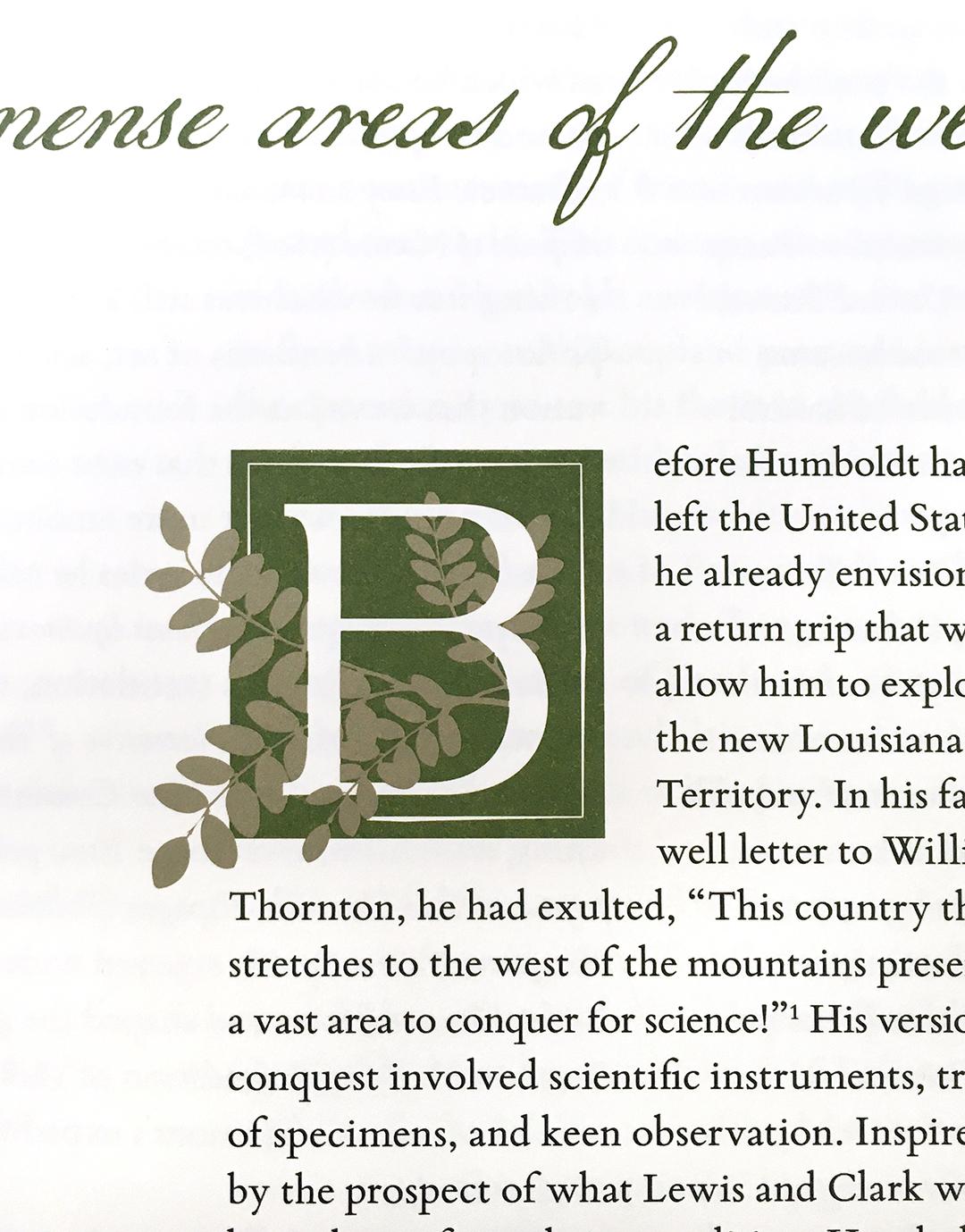
In chapter two's opener, black locust foliage surrounds the letter B.
Can you walk us through the process of catalogue design? How did you narrow your selection for this foliage design element?
I try to approach the book as an integrated whole, which means continually revisiting and refining each element as the design takes shape. I usually start by identifying a typeface with a historical relationship to the subject, which helps to ensure that the text will complement the artwork. If I’m mixing and matching typefaces, they all have to work together, and any other design elements, like the ornamental letters, have to harmonize as well. At every stage I ask myself, does the design support the subject? Does it complement the art without competing for attention?
For this project, my goal was to seek out twelve distinct foliage shapes that would be identifiable at a small scale, would work together as a set, and yet would be different enough from each another that the reader would hopefully notice that something had changed from one chapter to the next. Once I had the typography and twelve kinds of foliage working together, the last step in the process was to configure the leaves around the capital letters.
Are there any examples of synergy between the design and the featured artworks that you are particularly pleased with?
One of my favorite things about this design is that in certain places, I was able to match the foliage with something in the artwork on the facing page. For example, in Chapter 1, the jagged elm leaves twining around the capital O mimic the fur collar in Rembrandt Peale’s portrait of Thomas Jefferson. I placed the black walnut branch at the start of Chapter 3 because I liked the way its hanging flower strands evoked the scoops attached to cables in Charles Willson Peale’s Exhumation of the Mastodon. In Chapter 5, I thought the triangular shapes of the sweetgum leaves echoed the architecture of Mount Vernon. These details might not be something most readers will notice, but I hope people who read this will enjoy looking for these relationships and others in the book.

Graphic designer Karen Siatras in her home office with a copy of the Humboldt catalogue.
Alexander von Humboldt and the United States: Art, Nature, and Culture places American art squarely in the center of a conversation about Humboldt’s lasting influence with artworks that reveal how the American wilderness became emblematic of the country’s distinctive character. Learn more about this renowned Prussian naturalist and explorer through videos created for the exhibition. The catalogue, co-published by Princeton University Press, is available for purchase online ($75).